Photoshop调出颓废感觉的非主流色调(3)
来源:未知
作者:bbs.16xx8.com
学习:2185人次
作者:兔子 作者:佚名 出处:
此Photoshop调色教程非本站原创.教程中用到的素材人物源于网络.绝无冒犯之意,仅做引用.如有版权问题请联系删除.教程中的图片水印非本站打上.如果问题请联系删除.谢谢.希望大家喜欢这教程.
原创本教程介绍有点颓废感觉的非主流色调调色方法。作者用到的调色工具较少仅可选颜色和色彩平衡。先用可选颜色调出大致的底色,反复调整后再用色彩平衡把画面色调调均匀即可。色调可以按照自己的喜欢选择。
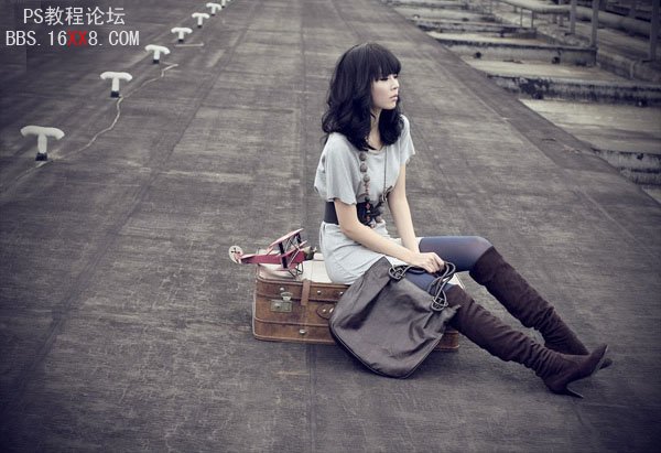
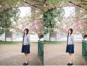
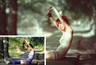
原图
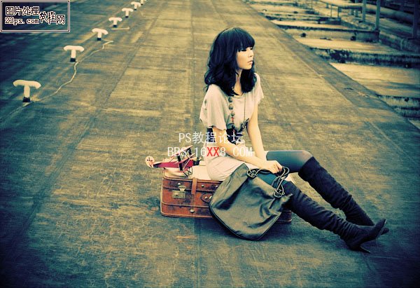
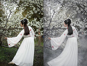
最终效果
1、打开原图,按ctrl+j把背景图层复制一层,图层混合模式改为“滤”色,不透明度改为:50%。
2、创建可选颜色调整图层,参数设置如下图。

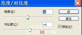
3、创建亮度/对比度调整图层,参数设置如下图。
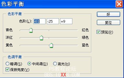
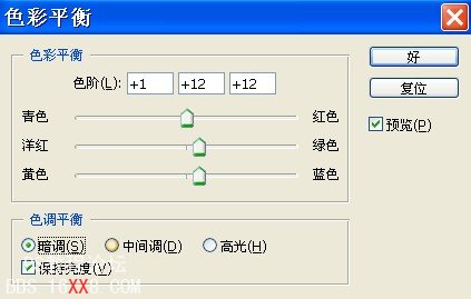
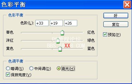
4、创建色彩平衡调整图层,对中间调,暗调,高光进行调整,参数设置如下图。
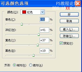
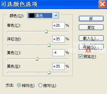
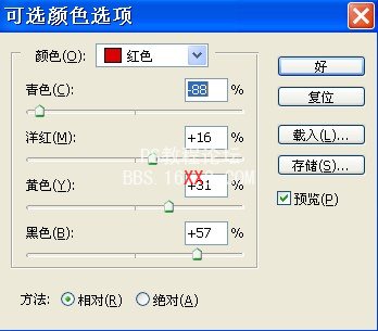
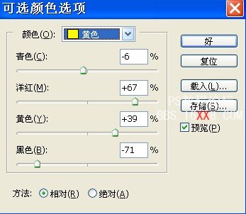
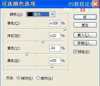
5、创建可选颜色调整图层,参数设置如下图。
6、新建图层,填充颜色#:FAD591,图层混合模式改为“正片叠底”,不透明度改为:52%。
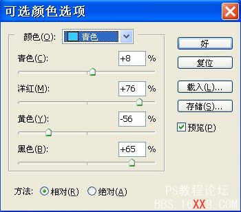
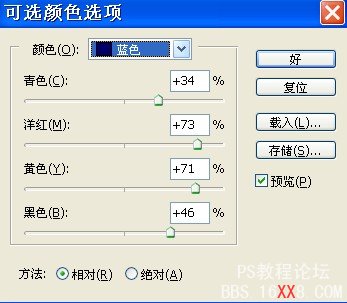
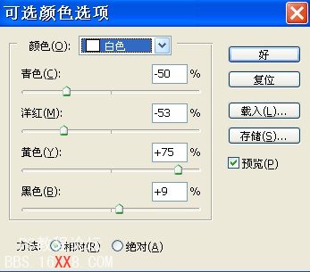
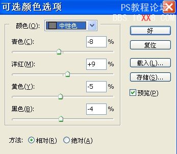
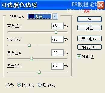
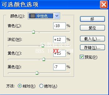
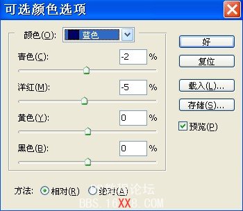
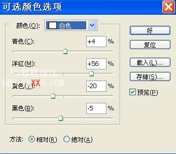
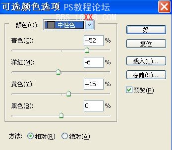
7、创建可选颜色调整图层,对蓝,白,中性色进行调整,参数设置如下图,确定后完成最终效果。
调色后最终效果:


学习 · 提示
相关教程
关注大神微博加入>>


网友求助,请回答!