PS制作Google Chrome浏览器Logo图标

原文来自:AdobeTutorialz
翻译:S.Shek
A detailed tutorial on how to create this awesome logo.
一篇详细的教程教你如何制作一个漂亮的logo.
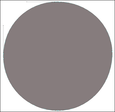
Begin working by creating a new file (File>New) of 854x854 px and 72 dpi. Use on it the Ellipse Tool (U) to represent the basis for the logotype to be of the Google Chrome browser.
先新建画布(文件>新建),大小854x854 px,分辨率72.用椭圆工具(U)画出一个Google Chrome浏览器图标的底层(译者:别忘了选定形状图层模式)

Select for this layer the parameters from below by making a mouse click on this layer on the layers?panel: Blending Options>Gradient Overlay
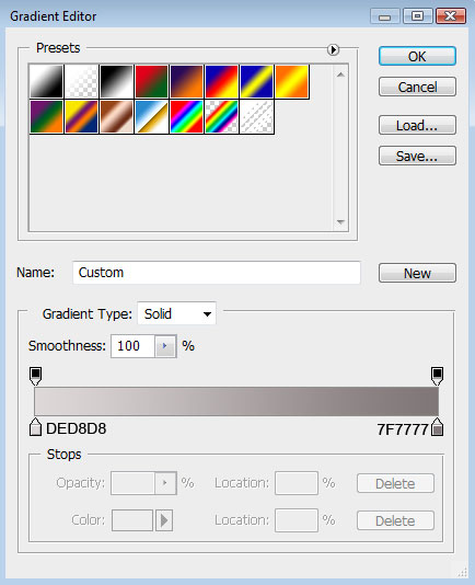
右键单击此图层,混合选项,图层样式中选择渐变叠加

Gradient parameters:
渐变设置如下(颜色:#DED8D8--#7F7777,样式:径向):


Using the same tool, try to make the next layer of the same element. Firstly apply the Ellipse Tool (U) to mark out the outside edges of the layer and then choose the Pen Tool (P) to cut out an inside opening. Its shape may be corrected with the Convert Point Tool.
再用椭圆工具重复上一步骤,画一个同样的圆边缘与之前的重合(译者:或直接复制一层去掉图层样式),然后用钢笔工具(P)在其内部切出我们需要的形状(译者:选择"从形状区域减去"或按住Alt键),然后利用转换点工具进行调整

The layer parameters: Blending Options>Bevel and Emboss
设置图层样式,选择斜面和浮雕(参数如下)

Make a copy of the recently made layer and use on it the Free Transform option. Press Maintain aspect ratio and make uniformly the copy smaller and then displace it easily. Move off the layer effect out of the copy. Select also the color #4E4A4A for the layer copy. Place the new layer under the previous one. This will be the shadow layer.
将此图层复制一份,使用自由变换工具,选择保持长宽比,均匀的缩小图层,去掉图层样式.选择颜色#4E4A4A,然后把这个复制层放在原图层的下方.这将作为阴影效果层


Create a new layer and use on it a standard brush (Brush Tool (B)) to paint the logotype sectors. Press preliminary Alt button and make a mouse click between the top logotype layer and the new one.
新建图层,使用标准画笔工具(B)为图标的表面扇叶部分上色,按住Alt键,再左键点击新图层和形状图层之间创建剪贴蒙版(具体参数如下)

Make a new copy of the logotype layer and apply the Bevel and Emboss options for the copy. Use the Convert Point Tool to change the placement of the tops and move off the layer effect. Place this new layer lower than the logotype layer with the effect (Bevel and Emboss), but above the layer containing the logotype shadow.
把带有斜面和浮雕效果的图层复制一份,用转换点工具改变一下它的形状位置,去掉图层样式(斜面和浮雕),然后把它放在形状层和阴影层之间


Create a new layer again situating it above the previous made one and do the same operations we did when painting the top layer (meaning the layer situated above the shadow layer, but lower than the logotype one).
再创建一个新图层,重复之前给扇叶上色时的步骤,为上一步骤复制的形状图层上色,具体参数如下图:

Make a copy of the mask layer where we used those three colors to paint the top layer of the logotype. Choose for this layer the Burn Tool (O) and the Dodge Tool (O) to draw several highlights and shadows on the logotype.
将为表面扇叶上色时的颜色图层复制一份,使用加深和减淡工具画上一些高光和阴影(如图)


Using the Ellipse Tool (U), try to represent the central element of the logotype. Place its layer lower than the top layer of the logotype.
使用椭圆工具(U)在图标的中心画一个圆形,将它放在顶层之下

The layer parameters: Fill 0%
Blending Options>Drop Shadow
图层参数设置为:填充:0%
图层样式(参数如图):
投影

Blending Options>Inner Shadow
内阴影

Blending Options>Gradient Overlay
渐变叠加


Gradient parameters:
渐变设置如图(颜色:#B1DEF4--#2D8EDF,样式:径向)

Try to represent the highlight ring around the logotype central part. For the beginning apply the Ellipse Tool (U) to represent the outside borders and then press Alt button while using the same tool to cut out an opening.
接下来试着在图标中心位置画上环状的高光,使用开始时的方法,用椭圆工具(U)画上圆形路径,然后按住Alt键进行切割(如图)

The layer parameters: Fill 40%
Blending Options>Gradient Overlay
图层设置:填充:40%
图层样式:渐变叠加


Gradient parameters:
渐变参数设置

Press Alt button and make a mouse click between the ring layer of the highlight and the previous layer:
将图层移至刚才制作高光阴影的那一层之上,按住Alt键点击两图层之间,创建剪贴蒙版.

On this stage we need to represent a highlight on the lowest part of the logotype. Select the Ellipse Tool (U) and represent the outside edges of the highlight along the bottom edge of the same logotype. Press the Alt button, while using the same tool, to erase the unnecessary elements of the picture. The layer color in this case is white.
接下来这一步,我们将画一道底部的高光,选择椭圆工具(U),沿着图标的底部画出高光的外边,再按住Alt键清除掉不必要的部分,图层颜色为白色

The layer parameters: Fill 25%
Blending mode-Lighter Color
图层设置:填充:25%
叠加模式:颜色减淡

The logotype is finished!
到这一步图标就完成了!

全教程完,学完记得交作业。如果本教程对您有所帮助,请推荐给你的朋友。

【原创教程 投稿邮箱: ps@16xx8.com】

长按二维码关注我们

关注我们微博:@photoshop教程论坛

推荐教程